Master
An AI investing guide representing
a specific style and philosophy
A redesign that makes picking the right Master and
strategy easy, and shows that the AI runs it all
from the first buy to closing the position.
Risk Tolerance
Strategy style
[ 01 — About Service ]
AI Master is a service where AI trades automatically according to the strategy a user selects.
Users can chat with the AI to get a strategy recommendation, or pick a Master they are interested in and browse the strategies inside it.
The service holds seven Masters, each representing a different investment style,
and every Master in turn holds several automated trading strategies.
An AI investing guide representing
a specific style and philosophy
The concrete automated trading
method a Master offers
Once a user picks a Master and a strategy and commits at least the required minimum,
the AI buys and sells automatically according to that strategy.
In other words, the user decides which strategy of which Master to commit
how much to, and the AI carries out the actual trading from there.
[ 02 — Current Experience ]
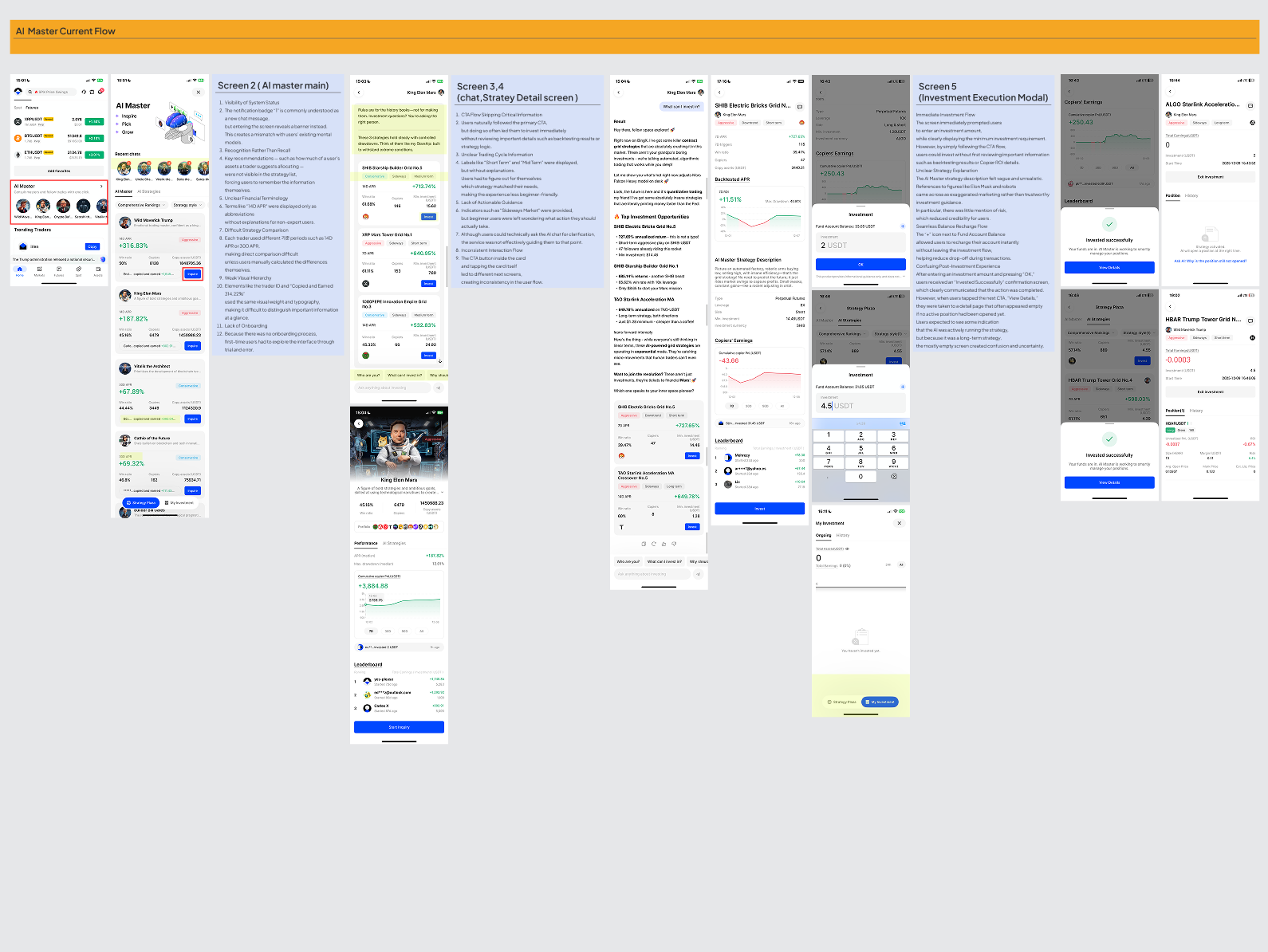
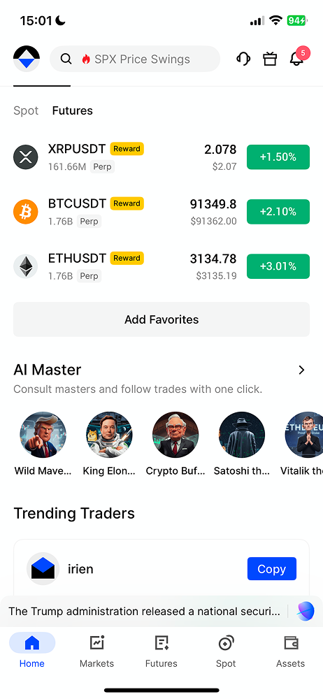
The existing screens offered many Masters and strategies, chat recommendations and trading features all at once.
But nothing guided users on what to check first, or in what order to decide.
Users had to work through seven Masters and theirmany strategies from scratch. Nothing told themwhat to judge a Master by, or what to read first.
Even once a strategy was recommended — by chat orby browsing Masters — it was hard to tell why, howfar the AI trades alone, or what to do next.Even when entering real money, how a strategy ends,how to stop it and how capital settles went unsaid.
Each Master scattered its strategies’ risk levelsand performance, so differences were slow to read.And to see the real price of the coin a strategytraded, users had to leave AI Master entirely.
[ 03.1 — Secondary Research · Community ]
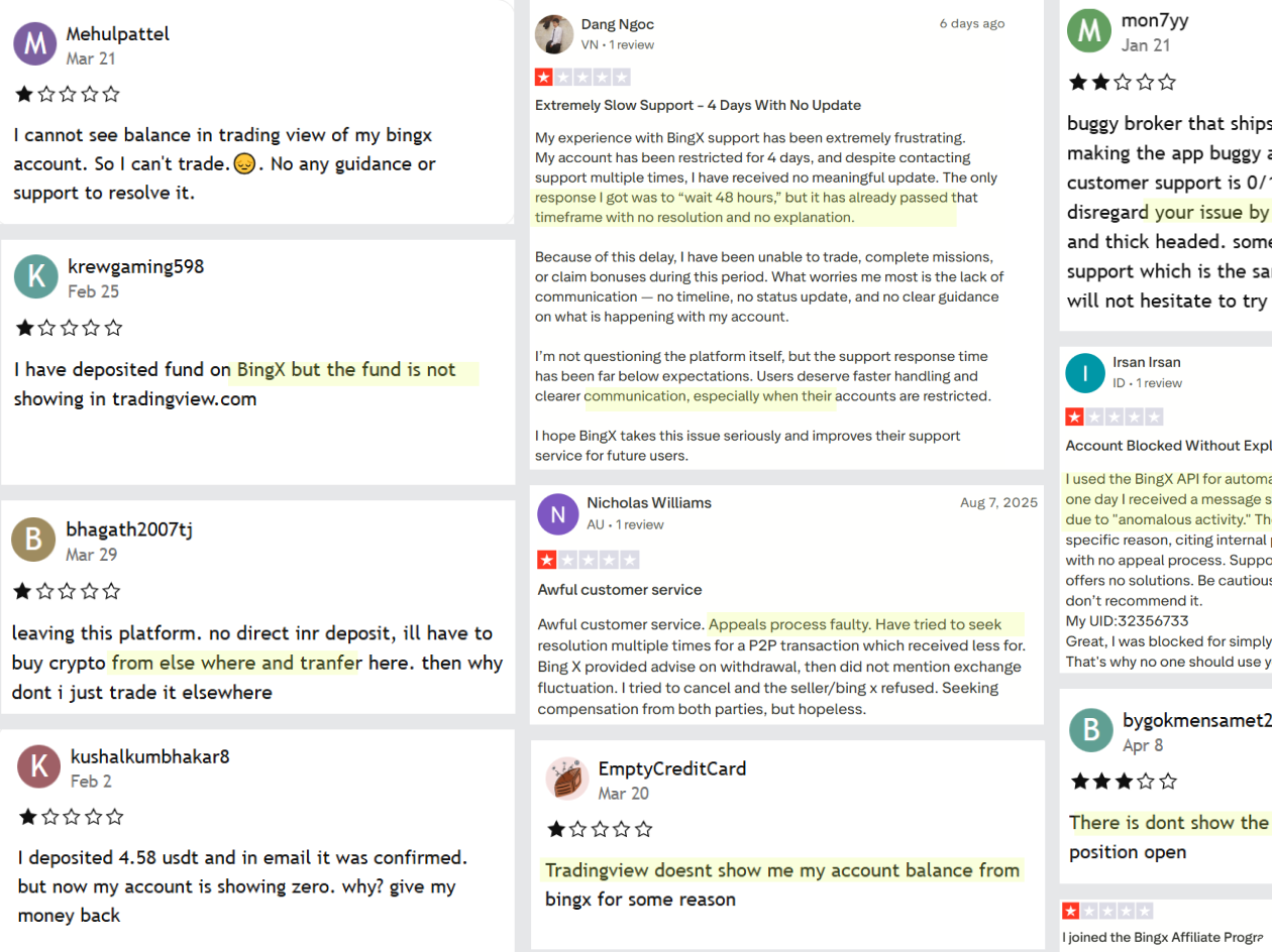
I looked at how users talked about AI investing on Reddit, Google Reviews and the App Store.
use to difficult not good interface
The interface feels too complex and hard to
use. It's difficult to understand what to do.
The reactions in these reviews went beyond “investment strategies are hard.”
Users also struggled to understand where to start in the service, and in what order to use it.
[ 03.2 — Secondary Research · Survey ]
To see whether the confusion found in the community also showed up in actual use,
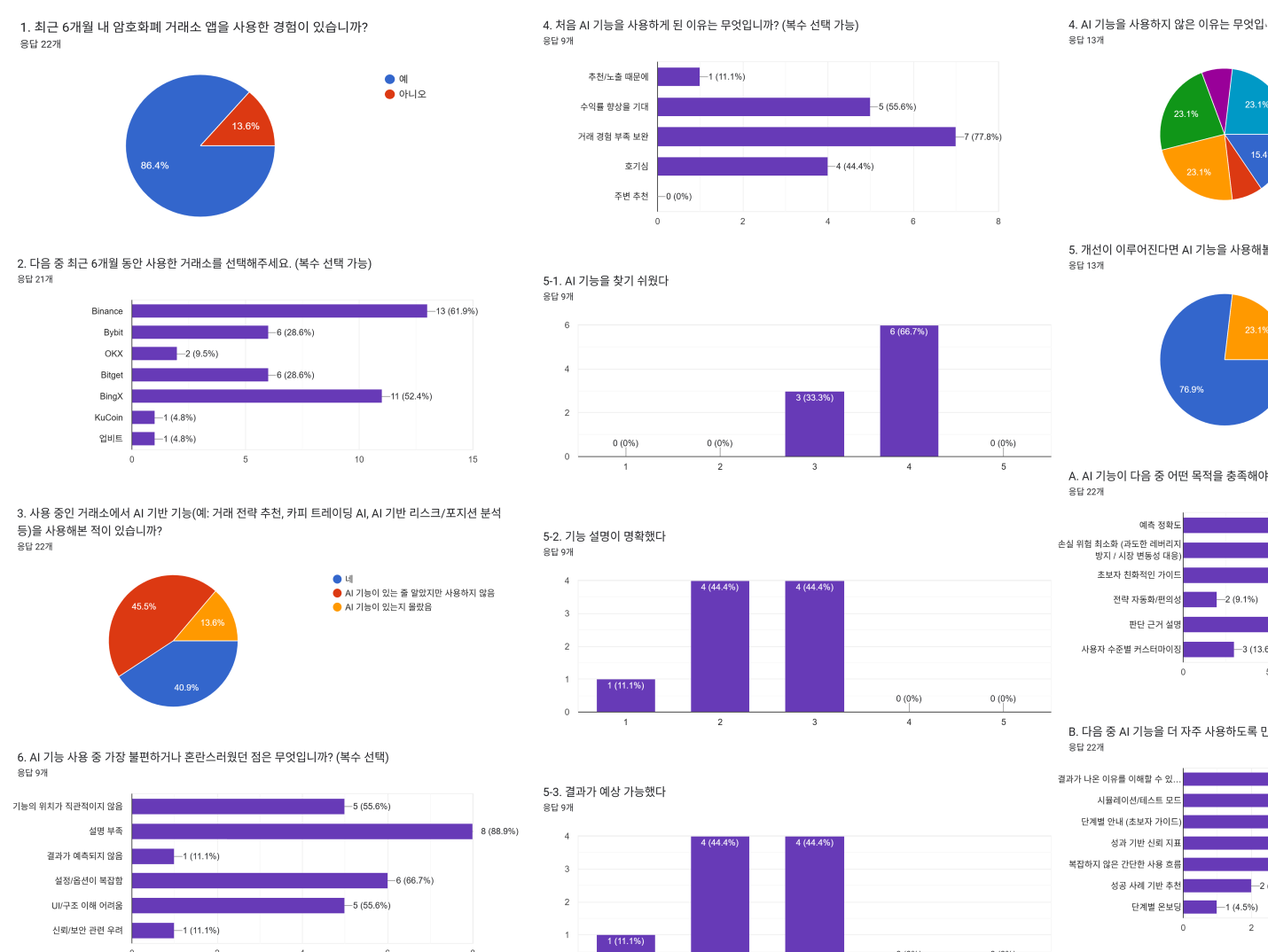
I asked 22 crypto exchange app users about their experience with AI-based features.
That included strategy recommendations, copy trading and risk analysis.
59.1%
13 of the 22 respondents had never used an exchange’s AI features. Ten knew about them and chose not to; three did not know they existed.
88.9%
Of the 9 respondents who had actually used AI features, 8 named “not enough explanation” as their biggest pain point.
76.9%
10 of the 13 non-users said they would be willing to try the features if they were improved.
Missing explanation alone cannot account for why people do not use AI features.
But not knowing what the AI does, or how to read its results, looked like one of the things holding them back.
The survey could not tell me at which moment users hesitate, or why they never start trading.
So I met users directly and asked about their concrete experience.
[ 04 — Primary Research · Interviews ]
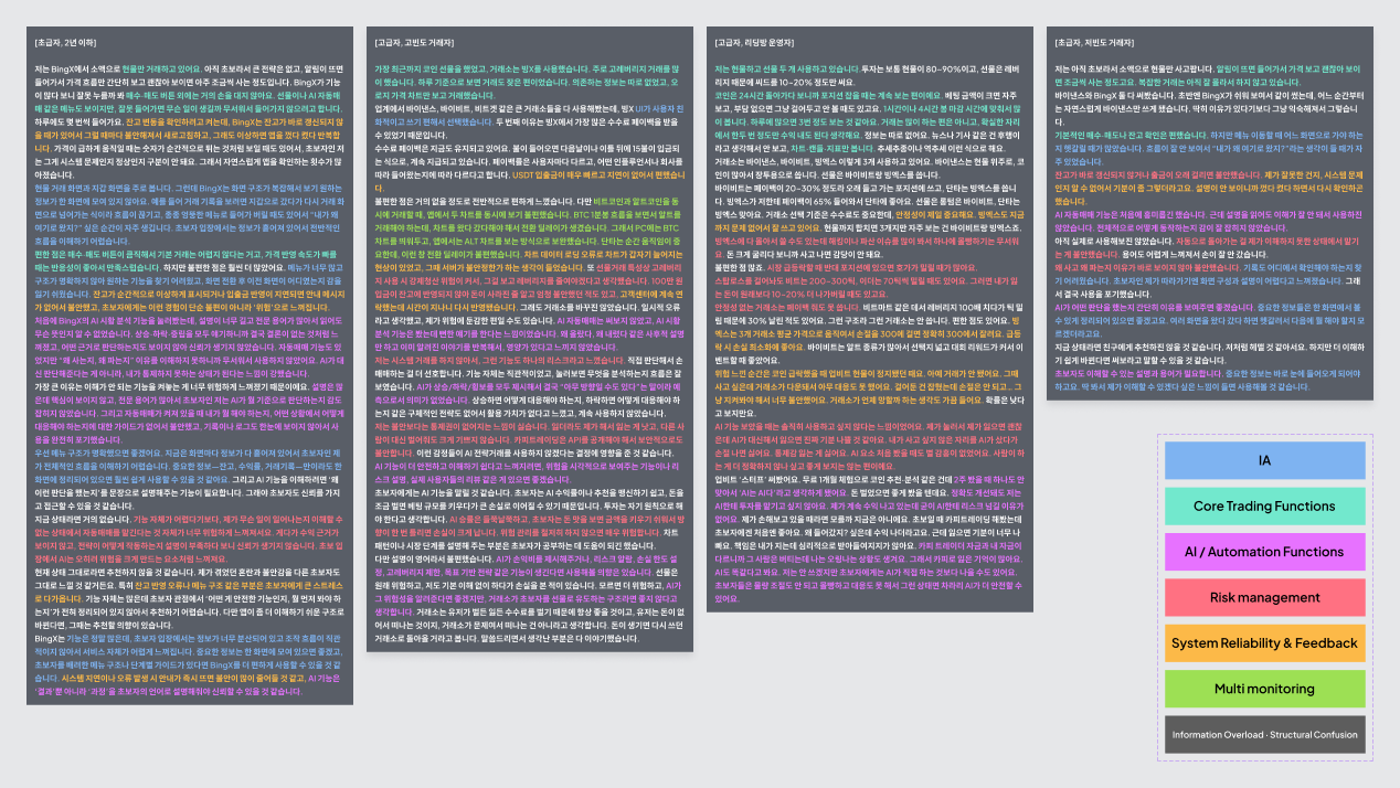
I interviewed four users with crypto trading experience, split by how much they had traded
: two beginners and two advanced. I compared how each group took to AI trading and where they hesitated.
[ 05 — Analysis ]
Grouping what came up in the interviews by similarity showed that
beginner and advanced participants hesitated for different reasons.
Beginner participants found it hard to judge which information
mattered, and which features and strategies they actually needed.
In AI Master too, they had no criteria for choosing a Master or a
strategy, so they moved back and forth across several screens.
It was unclear whether the AI only recommends, whether it also
buys and sells, and when a strategy ends.
The doubts grew sharpest on the screen where real money is
committed: how to stop a strategy, and when capital is settled.
Advanced participants already had their own trading principles
and methods. They treated reading the market and judging entry
and exit points as a core part of what makes trading worthwhile.
Advanced participants cared about execution speed, system
stability, and the reliability of the trading environment.
To them AI Master read less as a convenient automation tool than
as the risk of handing judgment and capital to an unproven system.
insight
Beginners were interested in AI trading but struggled with how to use it.
Advanced users understood it and still saw little need for it.
So we made beginner users, whose problem clearer explanation should shrink, the primary target.
[ 06 — Competitor Research ]
Robo-advisors and fund services ask first how you want to invest and what risk you take.
They then show each product’s return, risk and horizon in one format, so differences read easily.
AI Master and robo-advisors serve different products and users.
But in explaining unfamiliar options to a first-time visitor and helping
them choose something that fits, they solve the same problem.
The existing AI Master, by contrast, led with characters and strategies.
Users met a Master’s image and persona before they had established
their own style or compared strategies on shared criteria.
So rather than judging which strategy was closest to them,
users started from names they recognised or images that stood out.
[ 07.1 — Define · Empathy Map ]
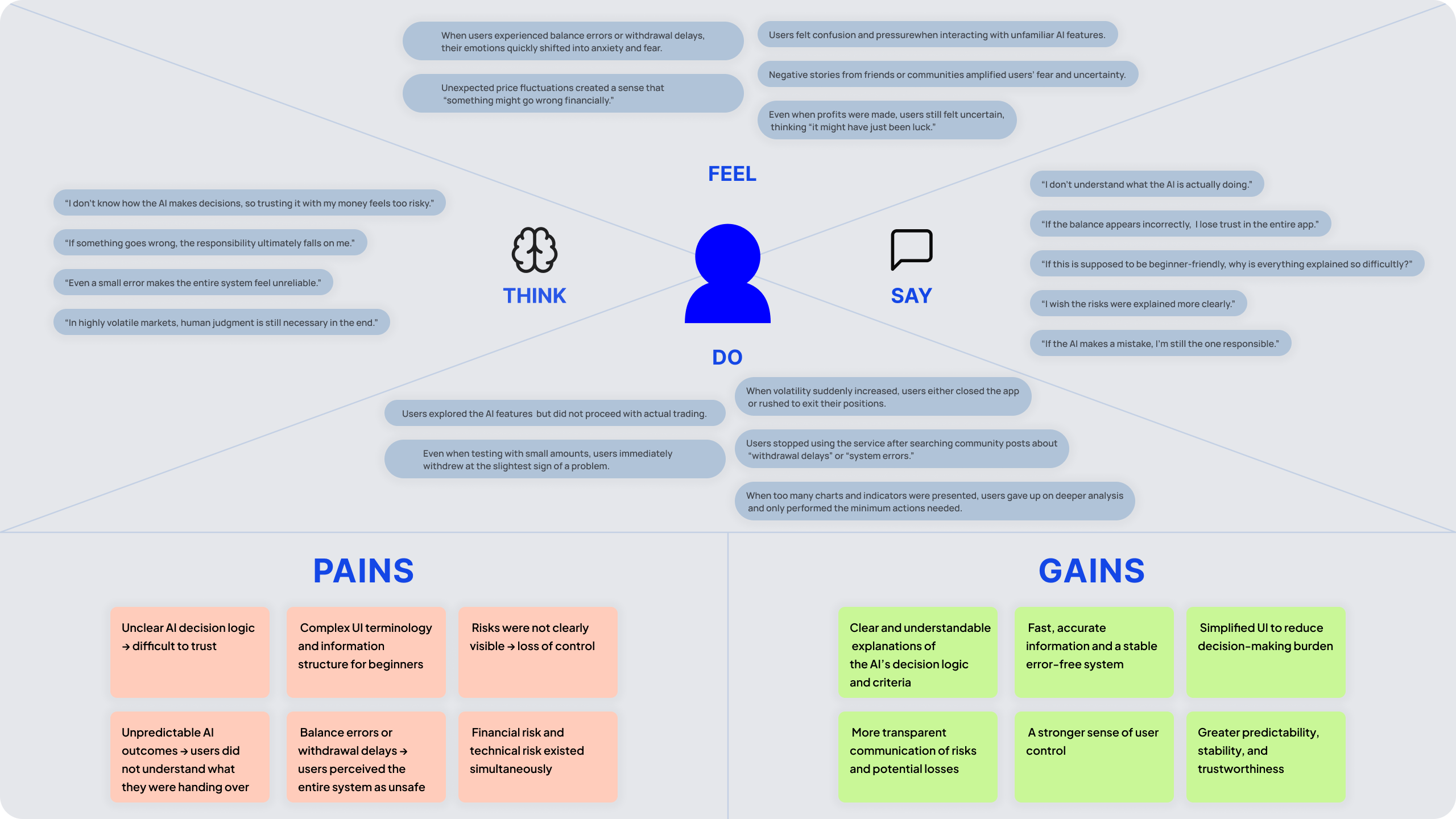
I pulled what users said and did across the interviews and community research into a single empathy map.
Without clearly understanding the differences between strategies,
Users took in Masters through impressions like ‘aggressive’ or ‘stable’.
But at the point of committing real money, an image or an impression was not enough to decide on.
They needed criteria that connected a strategy to their own situation
: the risk they could tolerate, the trading approach they preferred.
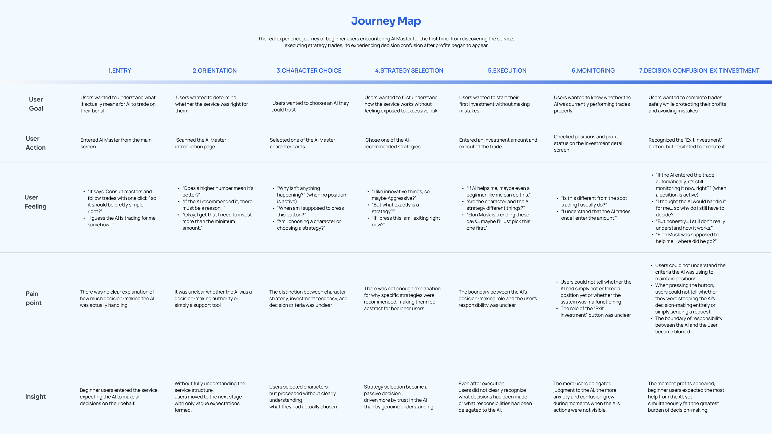
[ 07.2 — Define · User Journey ]
Users could explore strategies in two ways.
On the chat path, neither the fact that chat was the starting point for recommendations
nor how to hold the conversation was made clear.
On the direct path, it was hard to judge which of the many Masters and strategies to choose.
Both paths met at the step of selecting a strategy and entering an amount.
At that point users could not tell how far the AI trades automatically,
when the strategy ends, or how the capital is settled.
[ 07.3 — Define · HMW ]
How might we help beginner users choose a Master based on their own investment style?
How might we help users understand the current step and how far the AI automates on their behalf?
How might we help users check the AI's recommendation in a familiar way and continue the conversation?
How might we let users compare strategy performance against real coin prices without leaving the screen?
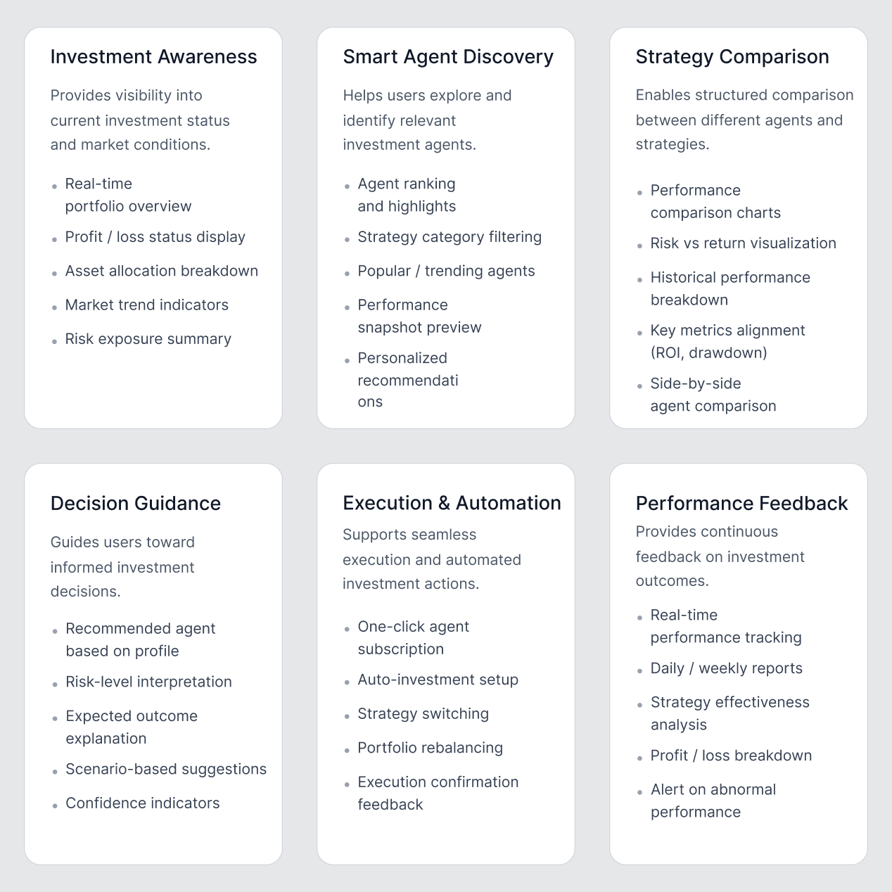
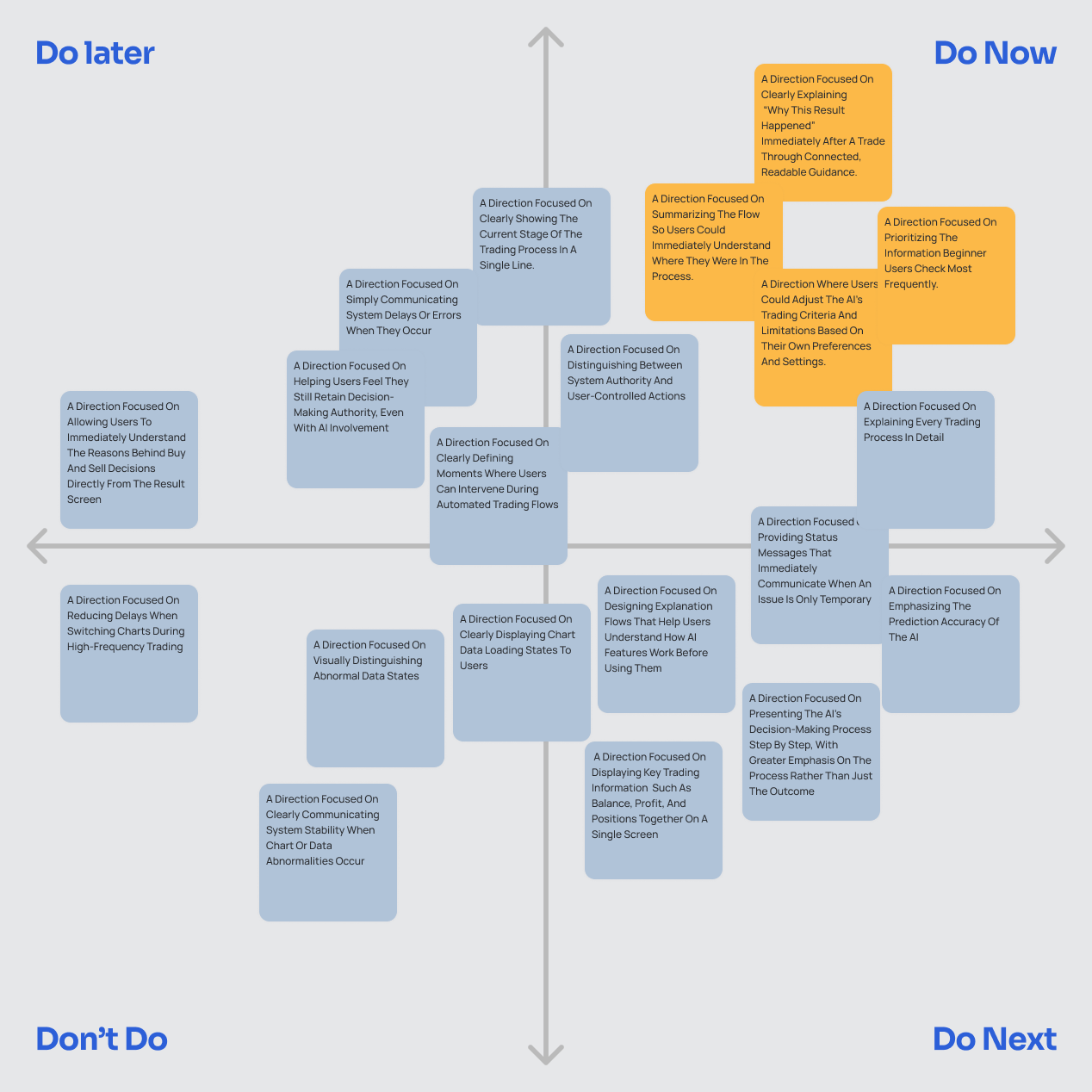
[ 08.1 — Feature Categorization & Prioritization ]
Rather than adding every feature we could, we decided to first solve the problem of users being unable to choose a strategy, and the problem of not understanding what happens after committing money.
We sorted ideas against two criteria.
[ 08.2 — Iteration ]
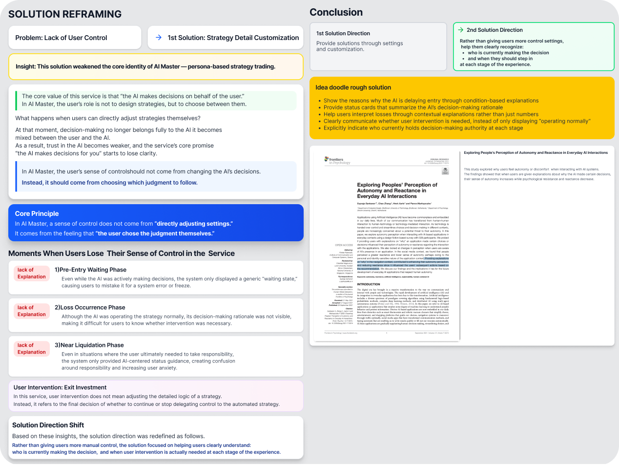
The first idea for building trust was to let users set the buy and sell conditions themselves.
We thought that if they could decide how their own money moves, their anxiety would ease.
But that approach put users back in the position of understanding and designing an investment strategy.
In the end it also weakened AI Master’s core value — the AI deciding and trading on the user’s behalf.
What beginner participants wanted was not more setup authority,
but to know the AI’s judgment and when they could step in.
So instead of manual settings, we shifted toward showing
who decides at each step and when the user can intervene.
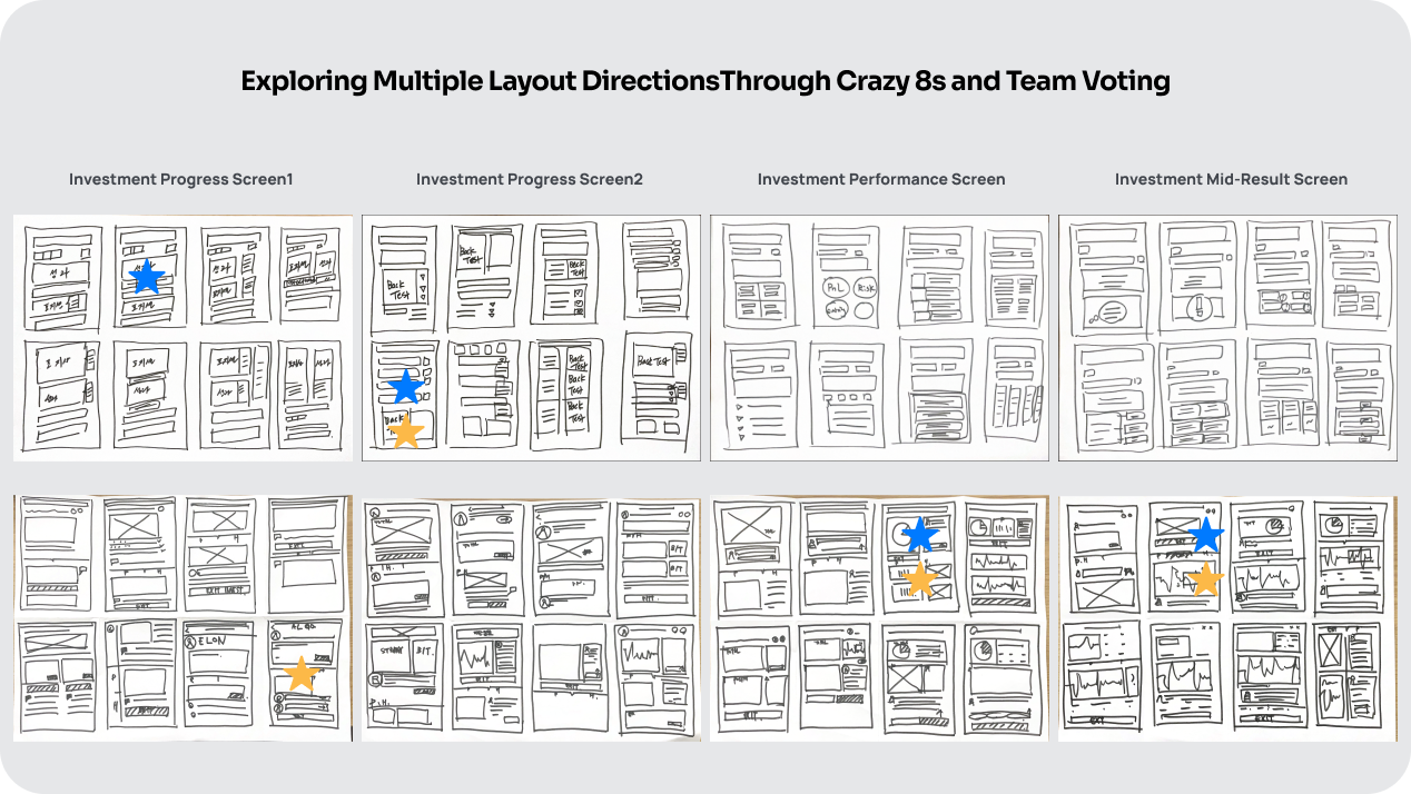
[ 08.3 — Crazy 8s ]
Using Crazy 8s, eight ideas sketched in eight minutes.
We explored several structures for onboarding, Master recommendation, strategy selection
and the execution confirmation screen.
We reviewed each idea against whether the information needed for comparison
reads on a single screen, and whether the next action is obvious to the user.
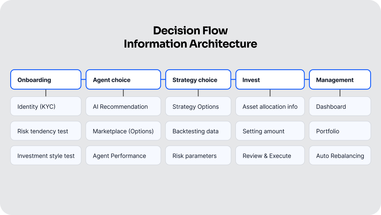
[ 08.4 — Information Architecture ]
We did not force the way users find a strategy into a single path.
We kept both — one for users who want a recommendation through conversation with the AI, and one for users who want to browse against their own investment style.
Get a recommendation by chatting
Browse it yourself
The two paths merge after a strategy is selected.
Whichever way a user comes in — chat or direct browsing — they confirm what the AI does and where they can intervene in exactly the same way before execution.
[ 08.5 — Wireframe & Design System ]
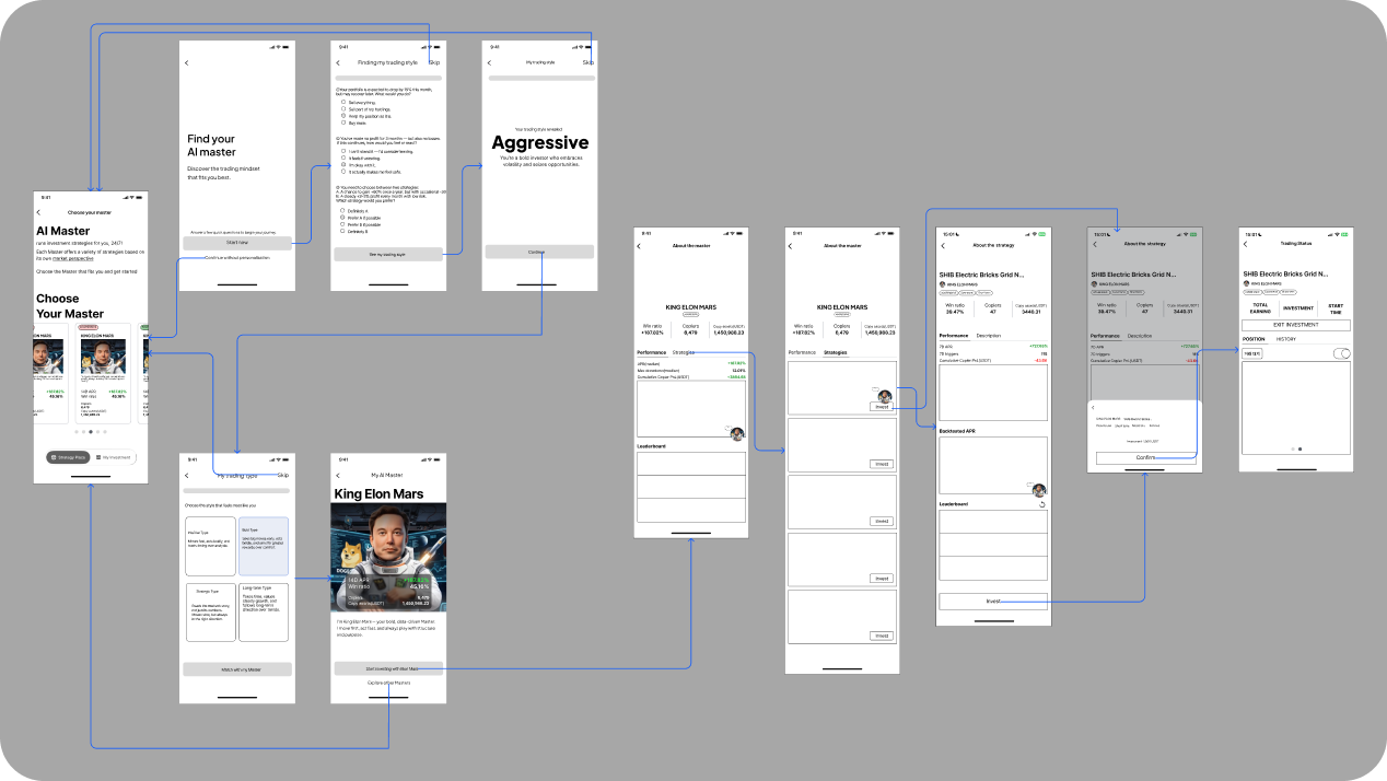
We first reviewed the order of information and the movement between screens as simple wireframes.
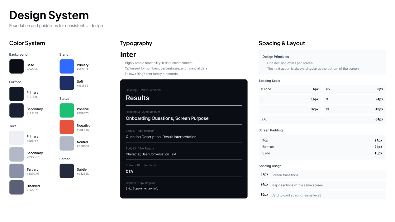
Then we organised components and visual rules so that the current step, the reason for a recommendation,
strategy information and the pre-execution notice all read the same way on every screen.
[ 09 — Key Features ]
[ PROBLEM ]
Users had to work through seven Masters and the many strategies inside them with no clear basis for choosing.
With no criteria to judge by, they fell back on names they recognised or images that stood out.
At the start of the service we ask two things first: the risk they can tolerate, Risk Tolerance, and the trading approach they prefer, Strategy Style.
Once answered, instead of showing every Master at once, we recommend the single Master closest to their investment style. Users go straight to that Master’s screen and start from the strategies it holds.
Cutting the first choice from seven to one lowers the cost of exploring, and lets users look at strategies while already holding criteria tied to their own style.
We did not remove exploration — we gave users a first yardstick for comparing other Masters and strategies against.
[ PROBLEM ]
Users struggled to tell whether they were choosing a Master, selecting a strategy, or actually committing their money.
We added a step structure at the top of the screen showing the current position and the next action.
Users can see what they are deciding right now, and each screen names the next action concretely — Browse strategies, Check the amount, Start the strategy.
On the final step, where the amount is entered, users re-confirm the AI’s automation scope and how the strategy ends before executing.
As a result, users can locate themselves and their next action without tapping through several screens.
[ PROBLEM ]
AI Master offered strategy recommendations through conversation with the AI. But on the existing screens the shape and placement of the chat icon, and the way a conversation started, differed from familiar messengers — so it never read as the entry point for recommendations.
We changed the shape and placement of the chat icon, and the way a conversation opens, to match the messengers users already know.
Users can open chat and start talking to the AI right away, without learning a new interaction pattern.
That framed chat not as a support feature, but clearly as a path for exploring — talking about the markets and approaches you care about and getting a strategy recommended.
[ PROBLEM ]
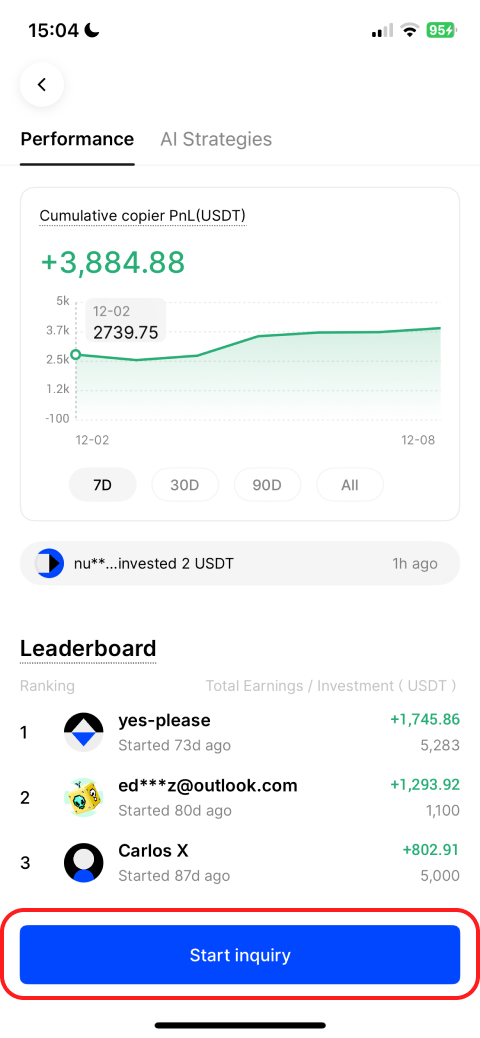
In the original AI Master you could see a selected strategy’s performance, but the actual price chart of the coin it traded was not connected to it.
To compare performance against real market movement, users had to leave AI Master and find the coin again in the chart list. Moving between screens also broke the context they were building.
We placed the strategy performance chart and the coin’s real price chart on the same screen, swipeable side to side.
Users can compare a strategy’s performance against real market movement back to back, without leaving AI Master.
Browsing strategy information through to reviewing performance now runs in one continuous flow.
[ 10 — User Test ]
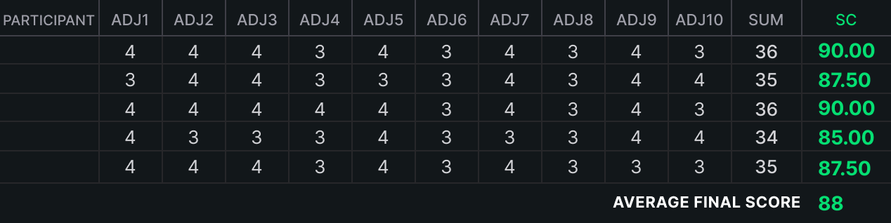
Using the redesigned prototype, we tested the core flow: entering an investment style, getting a Master recommended, selecting a strategy, and reviewing the information shown before execution.
All five usability test participants completed the flow
from browsing strategies through to the execution confirmation.
The redesign scored an average of 88 on the SUS (System Usability Scale),
which rates overall ease of use from 0 to 100 (n=5).
With five participants this was an exploratory test, so the SUS and task completion results are read as a reference for where to improve next, not as a settled measure of product performance.
[ 11 — Reflection ]
Users were not asking the AI to simply do more on their behalf.
They wanted to know what the AI was doing with their money, in what order the trading proceeds, and when they could step in.
At first I assumed that giving users more settings would increase their sense of control.
But in an AI service, letting users predict what the AI does and when they can intervene turned out
to be just as much a form of control as the range of things they can operate themselves.
Beyond which Master and strategy the AI recommended, we had to explain why it recommended them,
what it handles automatically once trading begins, and when the user can stop it.
Providing the right information at each uncertain moment was the precondition for a user handing money to the AI.
This research was exploratory: 22 survey respondents, 4 interviewees and 5 usability test participants.
The interviews in particular had only two participants per group and included experience with comparable AI trading features,
so I have not generalised the patterns found into characteristics of the market as a whole.
If this shipped, the first metric I would watch is the activation rate.
Here, activation rate means the share of users who start setting their investment style
and go on to select a Master and a strategy and complete their first strategy execution.
That metric would tell me whether clearer recommendation criteria
and pre-execution explanation actually convert exploration into a first trade.